

|
Tutorials | |
| by Bioinformatics Unit - CNIO || Terms of use || | [HOME] - [Documents] |


This data set corresponds to an experiment carried out by a grop of the Stanford University about the diauxic shift in S. cerevisiae
We keep from the file the values of the ratios of expression.
Now, we apply a logarithmic transformation (base 2) to the ratio, we remove patterns with less than 2 peaks over +1 or under -1 and we standardized the gene expression patterns. (See the tutorial on gene expression pattern)
Here is the corresponding dendogram when we use the UPGMA method with a linear correlation metrics on the resulting data set:
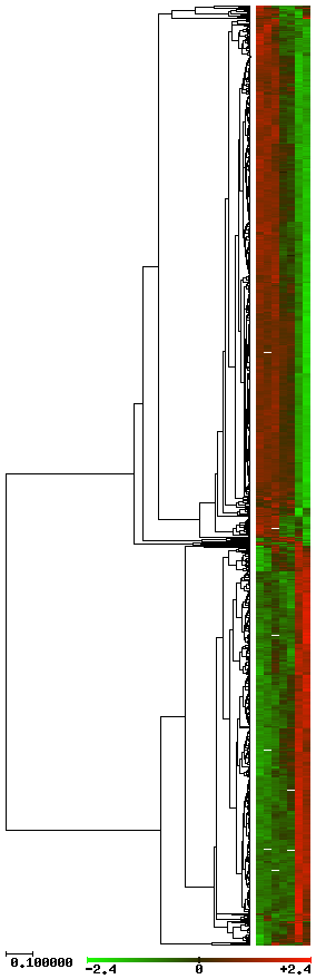
The gene expression patterns are shown on the left of the dendogram in a color scale, from light green to light red (see figure).
Here is the result when we use SOTA with a confidence value of 90%.
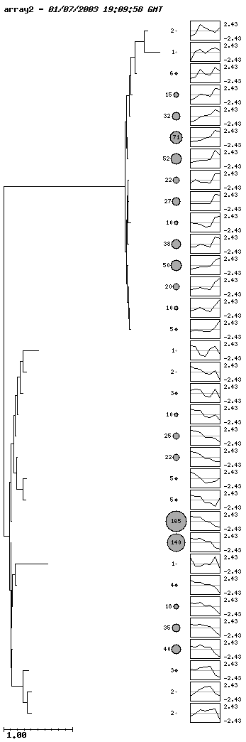
In this plot the size of the ratio of the circles is proportional to the amount of genes in that cluster. The patterns of the clusters appear on the right of the circles.
When using the server interactively, it is possible to click on the circles to get the list of the genes in that cluster. A plot with the profile of the cluster and the profiles of the genes in that cluster is also displayed.
Here is the result when we use SOM with a 5x8 hexagonal lattice.
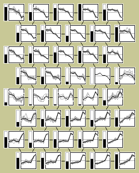
Each rectangle corresponds to a node of the map. The black thick line correponds to the profile of the node and the grey lines correpond to the profiles of the gene in that cluster. The black bars on the left of the profiles are proportional to the number of genes in the clusters.
When using the server interactively, it is possible to click on the nodes to get the list of the genes in that cluster. A plot with the profile of the cluster and the profiles of the genes in that cluster is also displayed.
Here is the result when we use the SOM-Tree. This dendogram is built with the node patters of the SOM map.
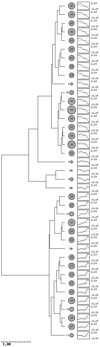
Again, when using the server interactively, it is possible to click on the circles to get the list of the genes in that cluster. A plot with the profile of the cluster and the profiles of the genes in that cluster is also displayed.
| Send comments. Last rev. Friday 17 January 2003 |