
All content on this tutorial (including text, photographs, plots, and any other original works), unless otherwise noted, is licensed under a
Creative Commons License.
Diagnosis and Normalization for MicroArray Data (DNMAD)
Plots
Boxplots
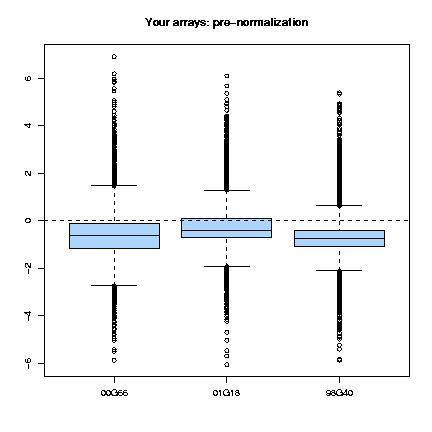
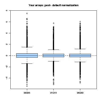
Those plots consist, as cited in Dudoit & Yang (2002), "of the median, the upper and lower quartiles, the range, and individual extreme values. The central box in the plot represents the inter-quartile range (IQR), which is defined as the difference between the 75th percentile and 25th percentile, i.e., the upper and lower quartiles. The line in the middle of the box represents the median; a measure of central location of the data. Extreme values, greater than 1.5 IQR above the 75th percentile and less than 1.5 IQR below the 25th percentile, are plotted individually." This type of plots can be done for the several slides (fig. 1) or for each slide, representing each print-tip group (fig. 2) and are shown both before and after normalization.
|
|
Fig. 1: Pre- and post-normalization boxplots for 3 arrays.
|
|
|
|
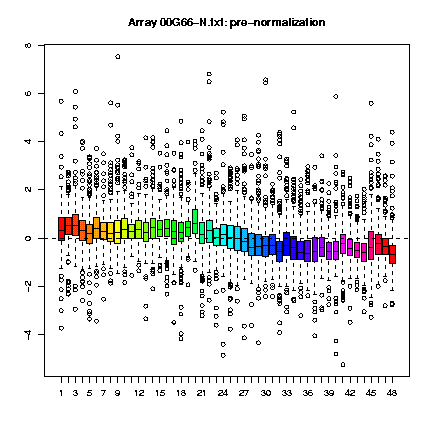
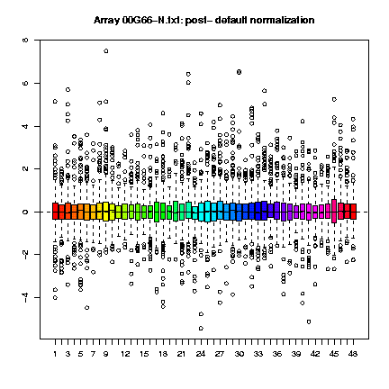
Fig. 1: Boxplots by print-tip-group of the pre- and post-normalization log-ratios M for the 00G66-N.txt array.
|
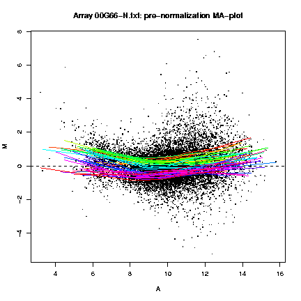
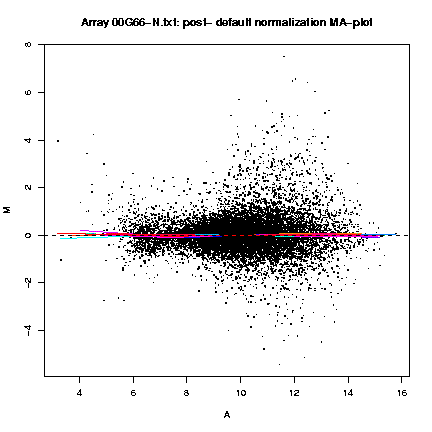
MA-plots
The MA-plots show the relationship between A (the "average signal" [0.5 * (log R + log G)], where R is the background subtracted red [mean of F635 - median of B635] and G the background subtracted green [mean of F532 - median of B532]) and M (the log [base 2] differential ratio: log(R/G)). These plots are shown both before and after normalization, and with different color lines for the lowess lines of each print-tip.
|
|
Fig. 1: Pre- and post-normalization MA-plots for the array 00G66-N.txt, with the lowess fits for individual print-tip-groups.
|
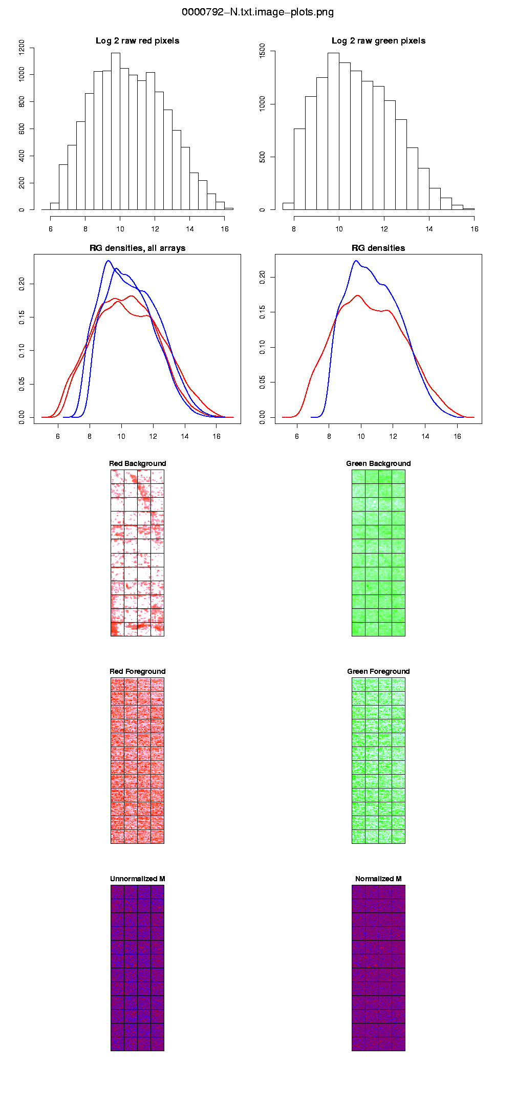
Diagnostic plots
These plots, that include the histograms of the raw intensities for each dye, allow you to check the quality of your arrays. We provide images of the arrays, including the red and green background, and the unnormalized and normalized M. These plots should help you spot damaged arrays, spatial patterns, or miscellaneous strange patterns.
The histograms of the raw pixel intensities provide the (log 2) of the red and green mean foregrounds. These values will often range between 0 and 16. You do not want to see values piling up in the higher end (that would probably mean a lot of saturation because the scanner was set too high), or on the low end (the hybridization did not work well).
|
|
Fig. 1: Diagnostic plots for the array 0000792-N.txt
|
References
Yang,Y.H., Dudoit,S., Luu,P., Lin,D.M., Peng,V., Ngai,J. and Speed,T.P. (2002) Normalization for CDNA microarray data: a robust composite method addressing single and multiple slide systhematic variation. Nucleic Acids Res., Vol.30, No.4, e15.
Smyth,G.K., Yang,Y.H. and Speed,T. (2003) Statistical issues in microarray data analysis. Functional Genomics: Methods and Protocols, M. J. Brownstein and A. B. Khodursky (eds.), Methods in Molecular Biology Volume 224, Humana Press, Totowa, NJ, pages 111-136
Smyth,G.K. and Speed,T. (2003). Normalization of cDNA microarray data. METHODS: Selecting Candidate Genes from DNA Array Screens: Application to Neuroscience. D. Carter (ed.)
Dudoit,S. and Yang,H.Y. (2003) Documentation of the Bioconductor's marrayPlots package. http://www.bioconductor.org
Acknowledgements
These tutorial has been prepared by Juan M. Vaquerizas. The author has been based on the help document for the DNMAD tool made by Ramón Díaz-Uriarte, and in the papers from Yang et al, 2002, and Dudoit & Yang, 2003.
Copyright
This tutorial is copyrighted. Copyright © 2003, 2004, Juan M. Vaquerizas, Ramón Díaz-Uriarte.
Questions? Comments? Send Juanma an
email.
Last modified: Fri Nov 14 2003